Tube strikes 2014: The week the Underground map was redrawn
Few maps can have been scrutinised more intently this week than the famous mish-mash of coloured lines based on Harry Beck's design

Get the free Morning Headlines email for news from our reporters across the world
Sign up to our free Morning Headlines email
If only Henry Charles Beck could see what they've done to his map this week.
Few maps can have been scrutinised more intently this week than the famous mish-mash of coloured lines based on a simplified topological design invented by Beck in 1933.
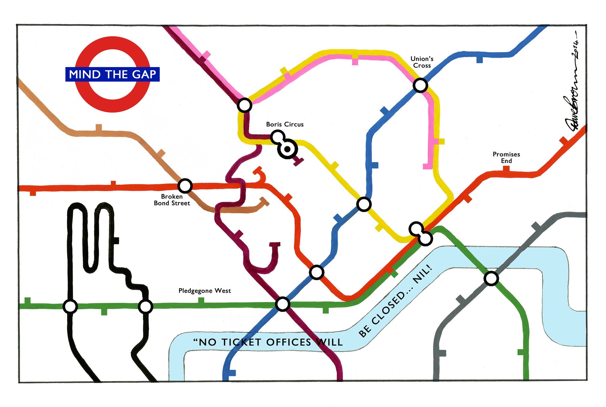
For some, the Tube map has presented artistic and satirical opportunities in particular Independent cartoonist Dave Brown who's take on Beck's famous layout features a recognisable face sending a message to Londoners (above).
But as Londoners attempt to complete their individual quests to get from A to B, one of an average three million that take place on the tube everyday, enterprising designers have sought to hack the map and make it suitable for the strike-stricken city.
With negotiations set to get underway to resolve the crisis ahead of a further planned strike next week Londoners will be hoping they don't have to resort to these innovative maps again.
There's been the wildly popular mocked-up modified map of what the tube will look like during the strikes by blogger @IanVisits.
And then there's the brilliant Walking Tube Map of London showing the walking distance between stations.
Subscribe to Independent Premium to bookmark this article
Want to bookmark your favourite articles and stories to read or reference later? Start your Independent Premium subscription today.
Join our commenting forum
Join thought-provoking conversations, follow other Independent readers and see their replies